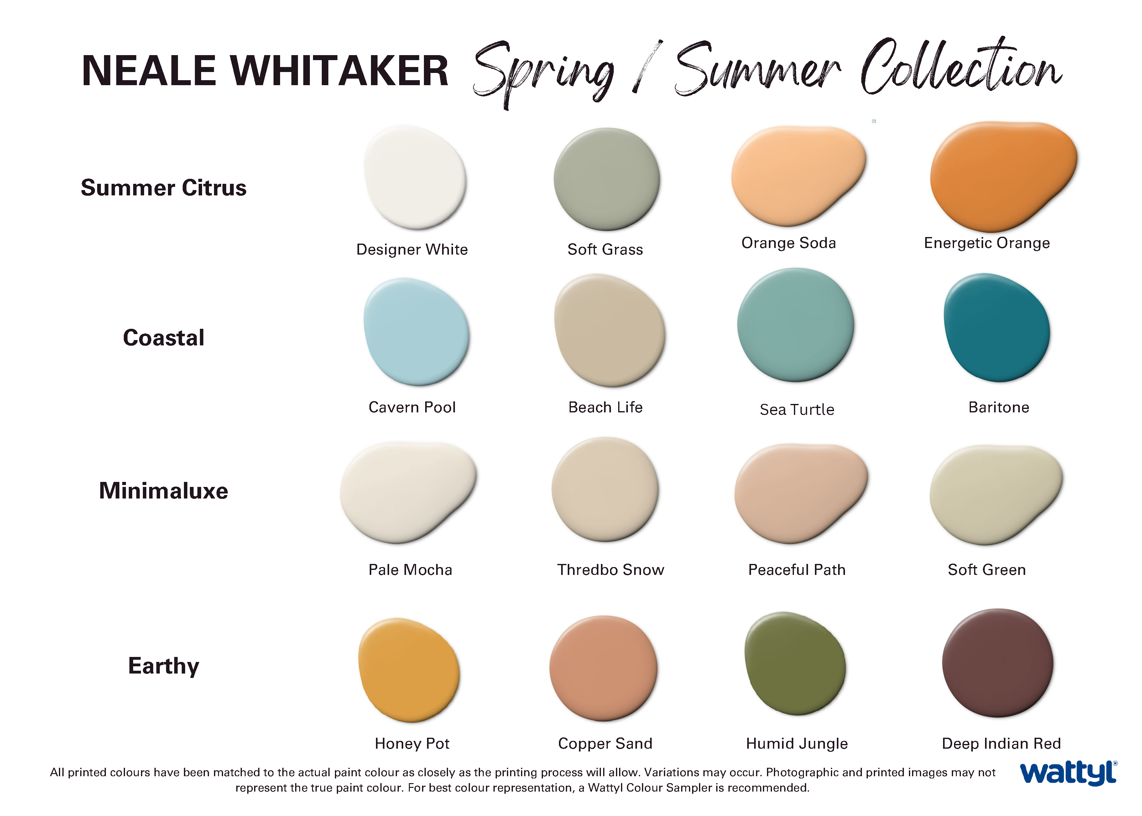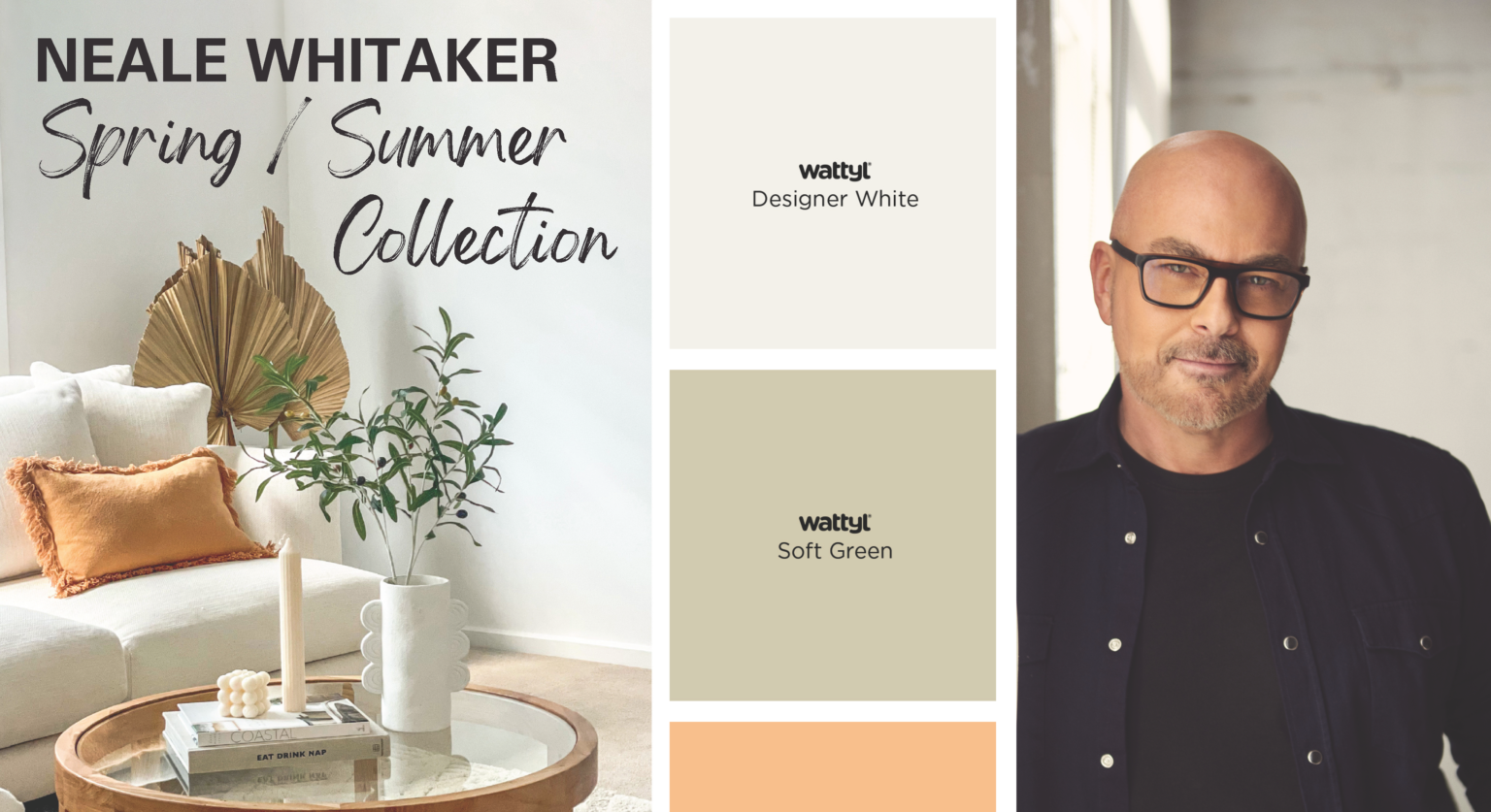
Embark on a Colourful Journey: Inside Neale Whitaker's Exclusive Spring/Summer 23' colour palette with Wattyl
At Home Collective, we’re always on the lookout for ways to infuse your living spaces with fresh inspiration. Recently, we had the privilege of hosting Wattyl’s Brand Ambassador, Neale Whitaker, who graciously shared insights into his latest venture—a Spring/Summer collection created in collaboration with Wattyl’s Colour Specialist, Katherine Champion. Neale, renowned for his discerning eye as a style aficionado and The Block judge, was excited about the prospect of crafting a capsule collection comprising just 16 carefully curated colours. According to him, this approach was designed to help people streamline their choices and effortlessly navigate the world of colours.
Unveiling the Spring/Summer ’23 Colour Palette
Neale’s collection draws inspiration from the ever-changing hues of the Australian landscape, particularly the scenic beauty of the NSW south coast, where he resides. The ever-changing kaleidoscope of colours, from the shimmering blue greens of the escarpments to the silver greys of the gums and the blues of the ocean, serves as a constant source of inspiration for Neale.
It’s a palette that moves gently and seamlessly from country to coastal.
Neale’s collection is a celebration of ‘new neutrals,’ offering a well-rounded palette that embraces warm whites, citrus tones, and coastal blues and greens. Designed for both interior and exterior spaces, these colours embody the warmth and beauty of an Australian summer.
Summer Citrus
Neale’s insights on the Summer Citrus palette highlight the invigorating and deeply spiritual qualities of these fresh, energizing hues. The oranges, in particular, impart a welcoming glow, making them perfect for creating an inviting and visually appealing space.
Coastal
Neale’s vision for the Coastal – Summer Days palette is reflected in his words, “Four coastal hues that work well in combination, or used individually – they bring a sense of blue skies and ocean breezes to an interior.” The colours in this palette echo the soothing tones of water and sand, creating a serene ambiance in any space.
Minimaluxe
“The Minimaluxe palette has more depth than traditional whites and gives a luxurious take on neutrals,” Neale observed. This section of the collection offers warm, organic whites and softer neutrals that provide a calming backdrop for statement pieces.
Earthy
Neale remarked, “These warm, earthy hues add warmth and richness to an interior palette, working beautifully together, or as accent colours.” The colours in this palette pay homage to the Australian landscape, introducing depth and meaning to any interior space.